
PRE-PRODUCTION
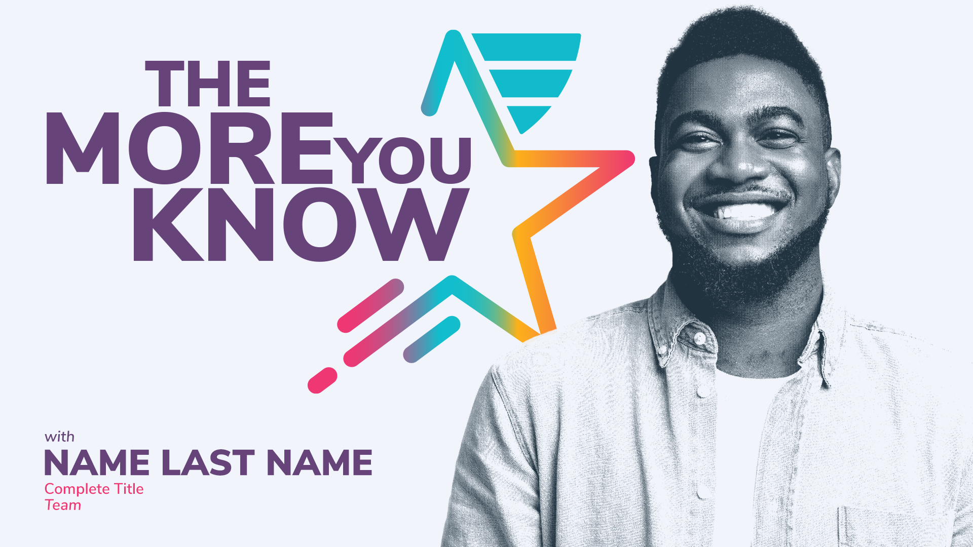
The People & Culture team takes care of the Human Resources side of things at Aceable. They noticed a need for more relatable job descriptions and better understanding of everyone's roles and the various departments across the company. So, they reached out with the idea of a series of interviews where folks from different departments chat about their daily tasks and how these align with our values. The series would be called The More You Know and with that we would hopefully ignite collaboration and fresh ideas across departments. Plus, it'd be a fantastic way to foster stronger connections between teams.
LOGO & COLOR PALETTE
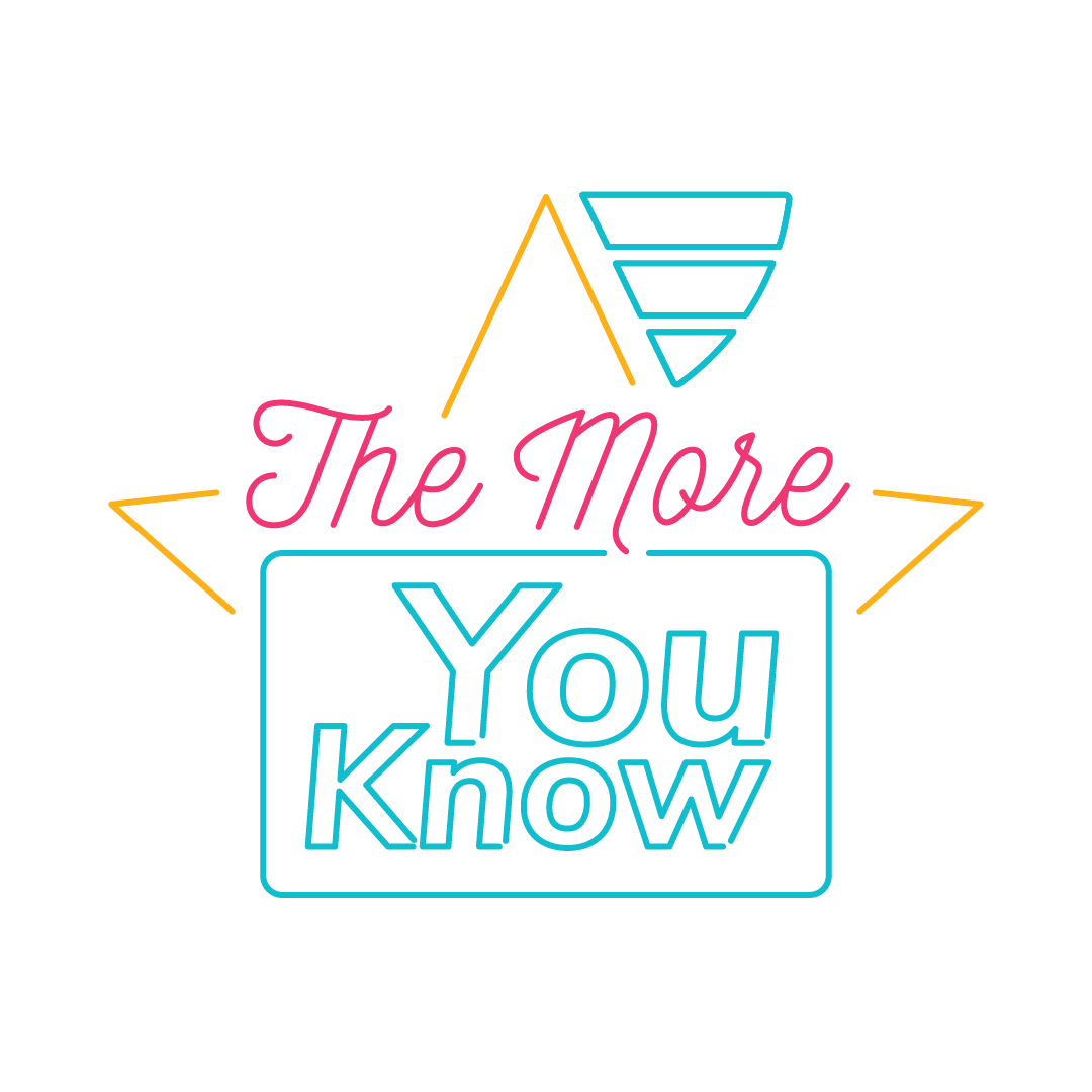
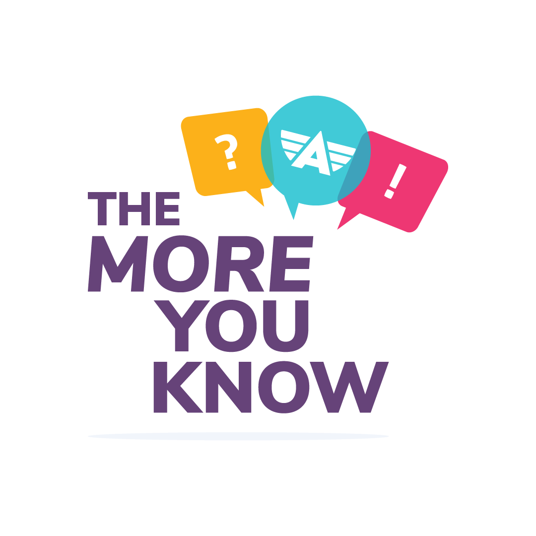
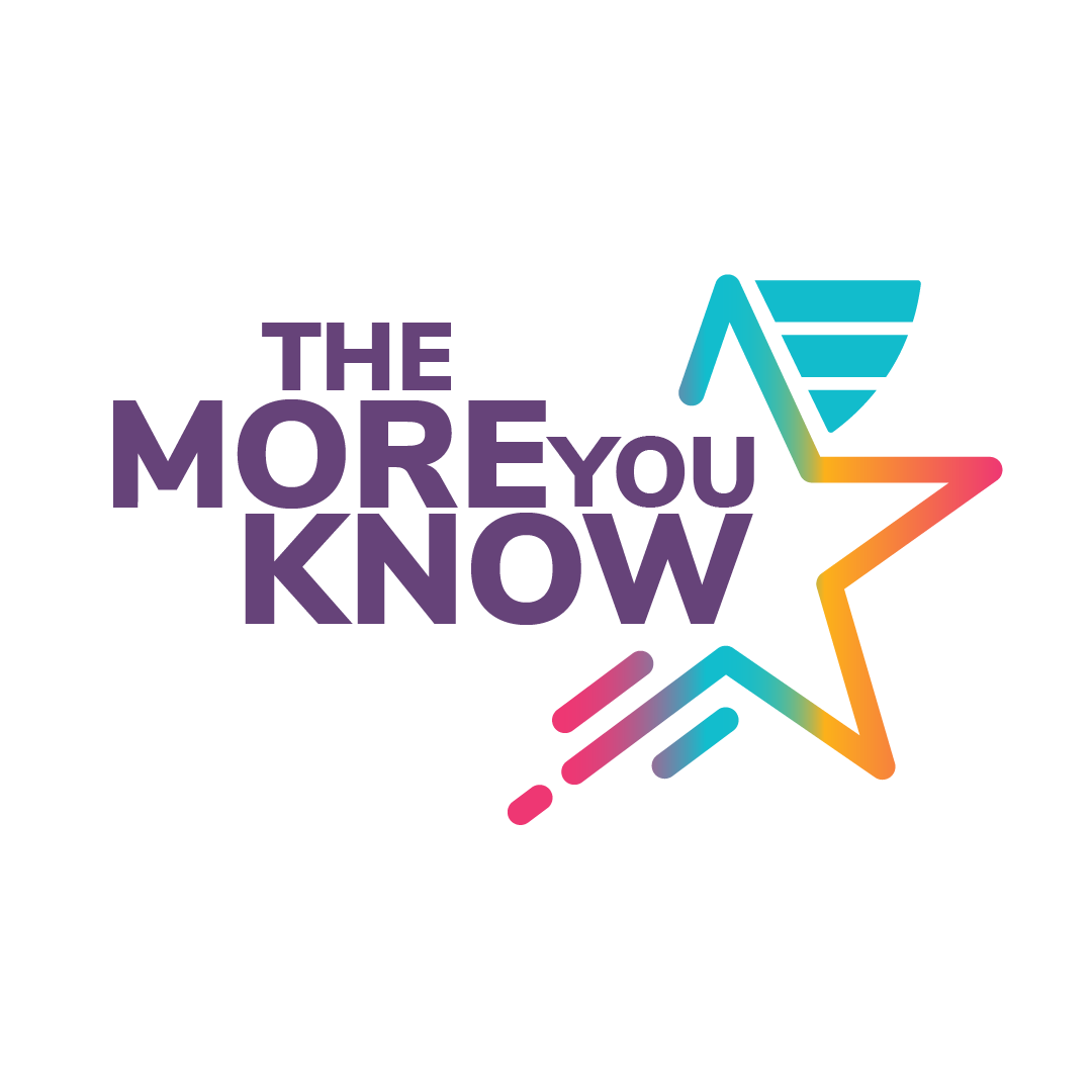
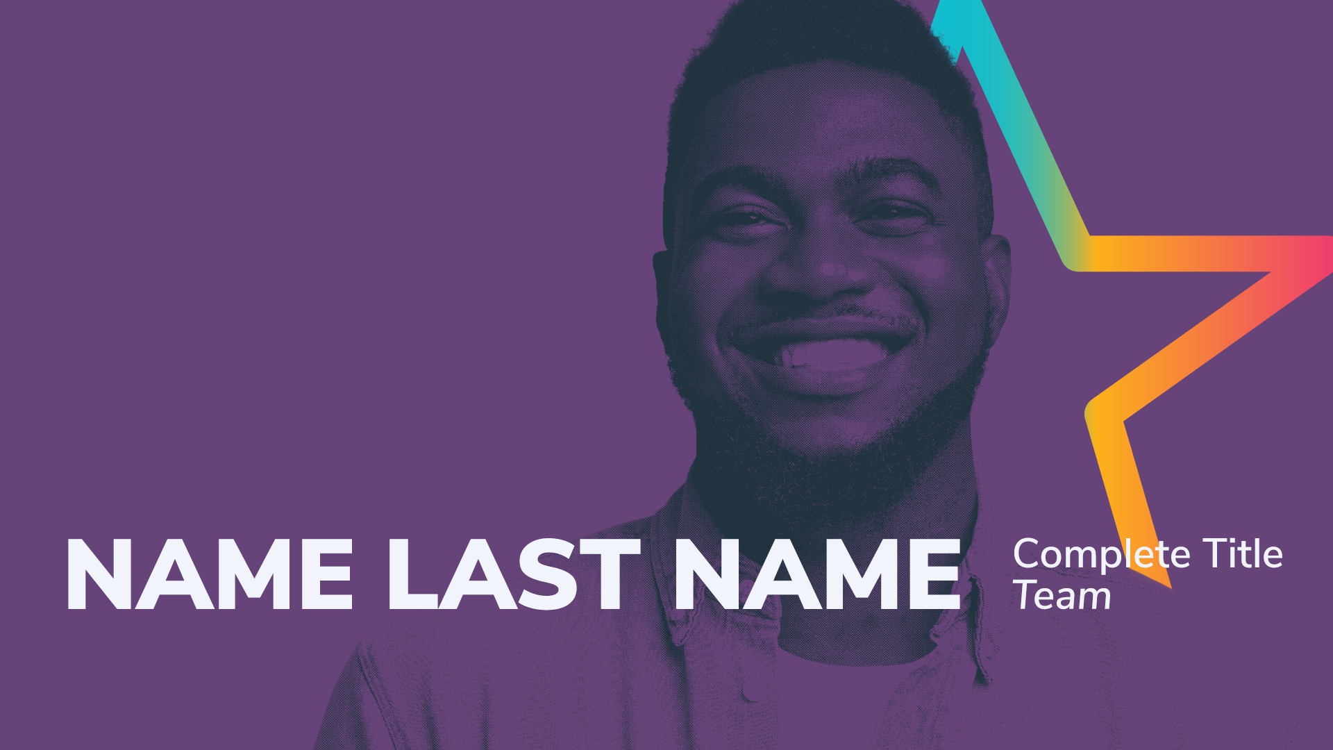
We aimed for a logo that could capture that lively "talent/quiz show" feel. After experimenting with neon sign aesthetics and seeking something reminiscent of flashcards, I stumbled upon a fusion of those two concepts that felt just right. Another important aspect to me was showcasing our company's diversity, so I went with a colorful palette that borrows inspiration from our own brand colors.
VISUAL IDENTITY
With the logo in place, my next task was to craft a visual identity that would embody that captivating game show ambiance. I aimed for a look that balanced vibrancy with a touch of maturity, given the colorful palette chosen for the logo.
I also wanted to ensure that the identity prominently featured the interviewed individuals and their respective departments right in the opening title. This way, viewers could readily identify their colleagues even before they appeared on screen or were introduced.
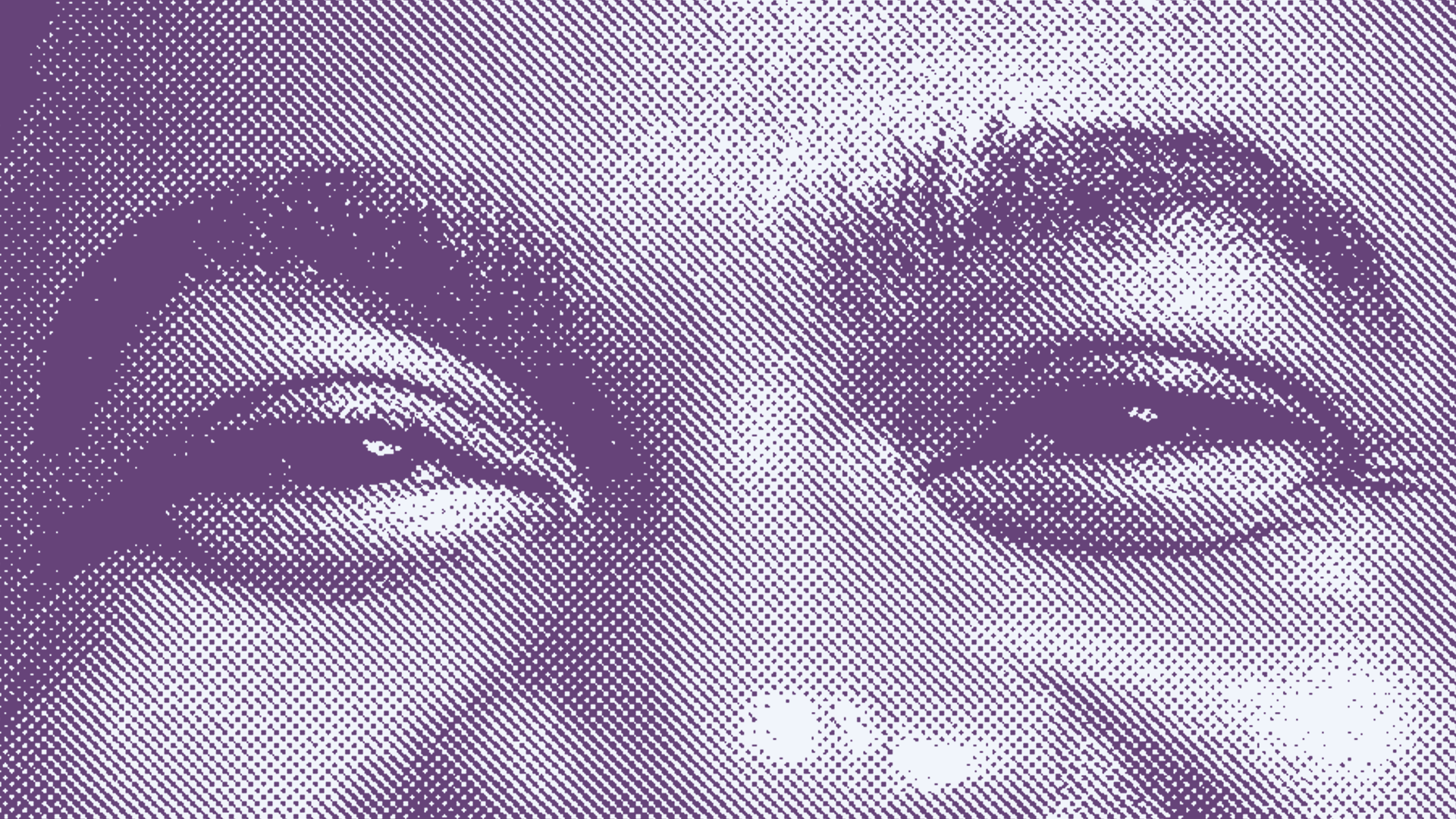
It's worth noting that not all our interviewees had high-quality or sufficiently large photos. Here, the halftone screen proved to be a strategic choice, magically transforming even the smallest and less detailed images into clean, uncomplicated representations that seamlessly complemented their names and titles.
Furthermore, the use of halftone screens introduced a delightful touch of nostalgia and a direct nod to the pop culture references ingrained in game shows branding and tone.

ANIMATION AND EDITING
The most exciting part of any project is to make everything come to life, and in this case, it was all about making the designs and screens move with After Effects. Often to me it's not just about following a strict plan; it's about letting that creative instinct guide the animation process. This time was no exception.
I had a hunch that incorporating glitch transitions would add a dynamic twist to the style, a clever counterpoint to the vintage charm brought by the halftone screen headshots. The rest was an art of improvisation, fine-tuning, and ensuring that every element seamlessly communicated with the others.
Editing all the interviews into episodes also fell under my responsibilities, along with crafting the sound design. I opted for simplicity in this aspect because the interviews were rich in relevant content, and I wanted to keep the focus on our interviewees' voices. No need for loud music or sound effects to steal the spotlight.
All videos for this series can be found in Aceable's P&C YouTube Channel.
All videos for this series can be found in Aceable's P&C YouTube Channel.